
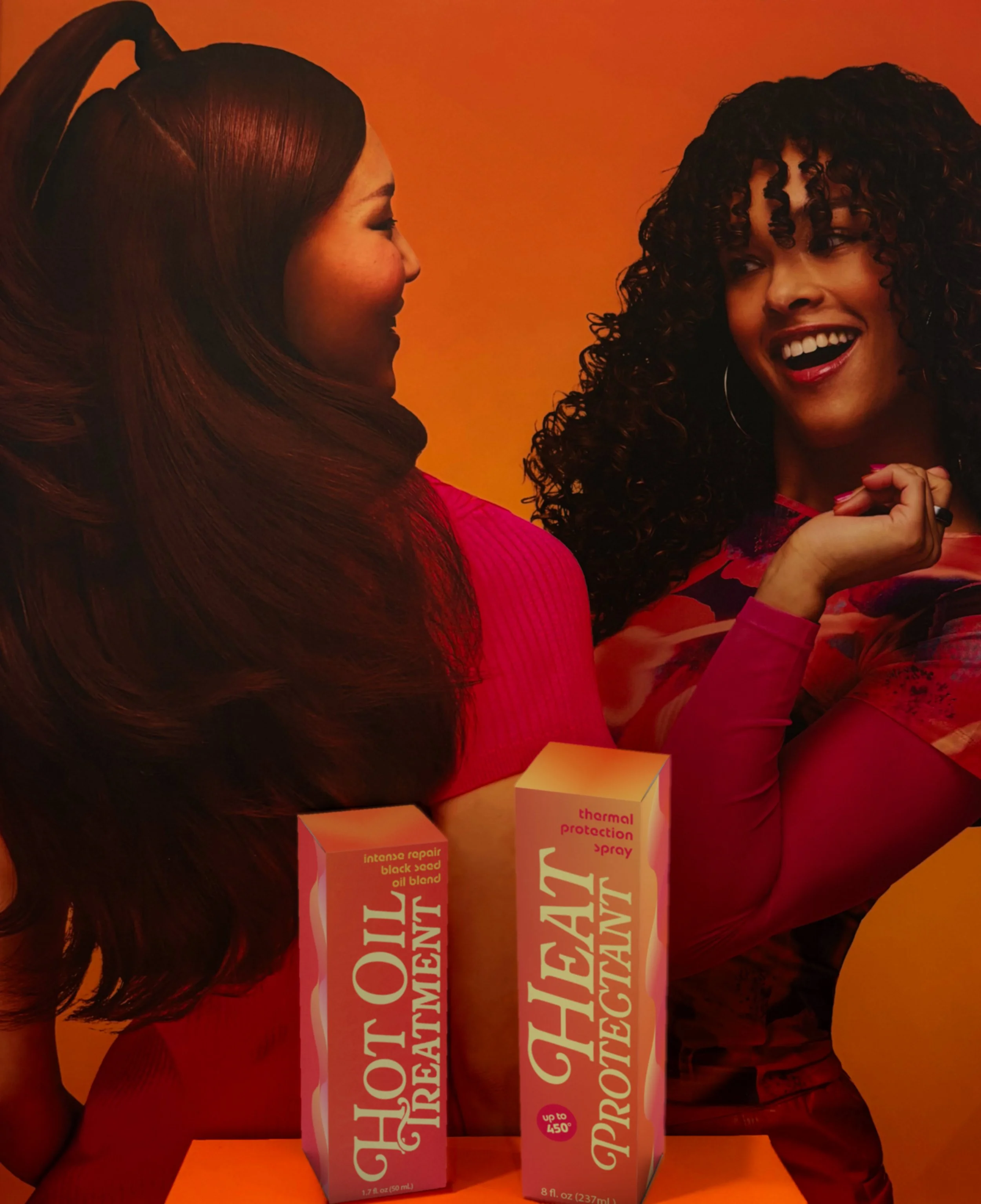
Hot Stuff!
Packaging and Retail Display
Hot Stuff is a hair care packaging and retail display concept inspired by Donna Summer’s bold, glamorous disco era. The project combines vibrant graphics, expressive typography, and retro-inspired details to create a product line that feels energetic and playful. Designed as a full retail experience, the identity extends from individual packaging to a custom display that brings the collection together on shelf.
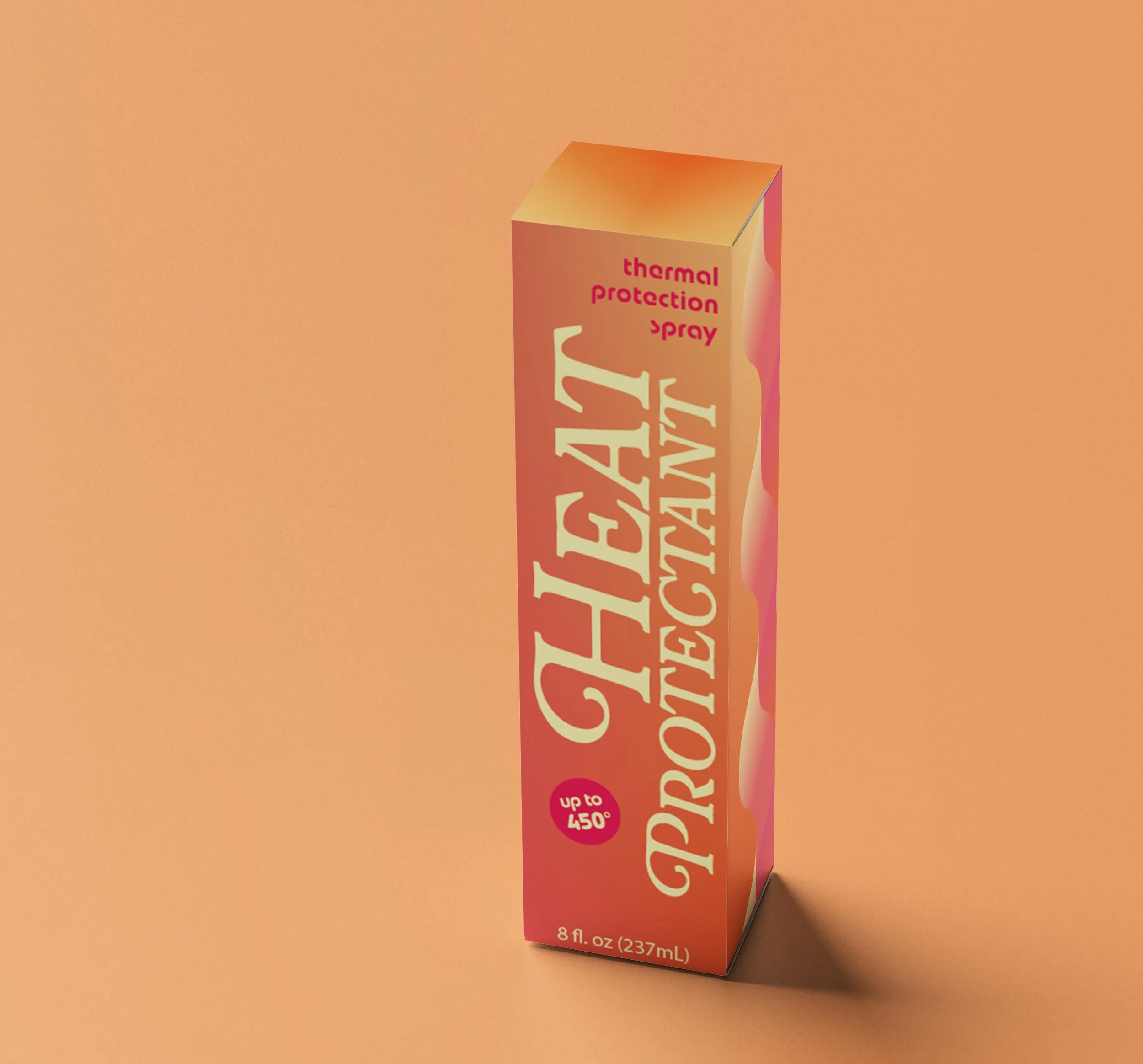
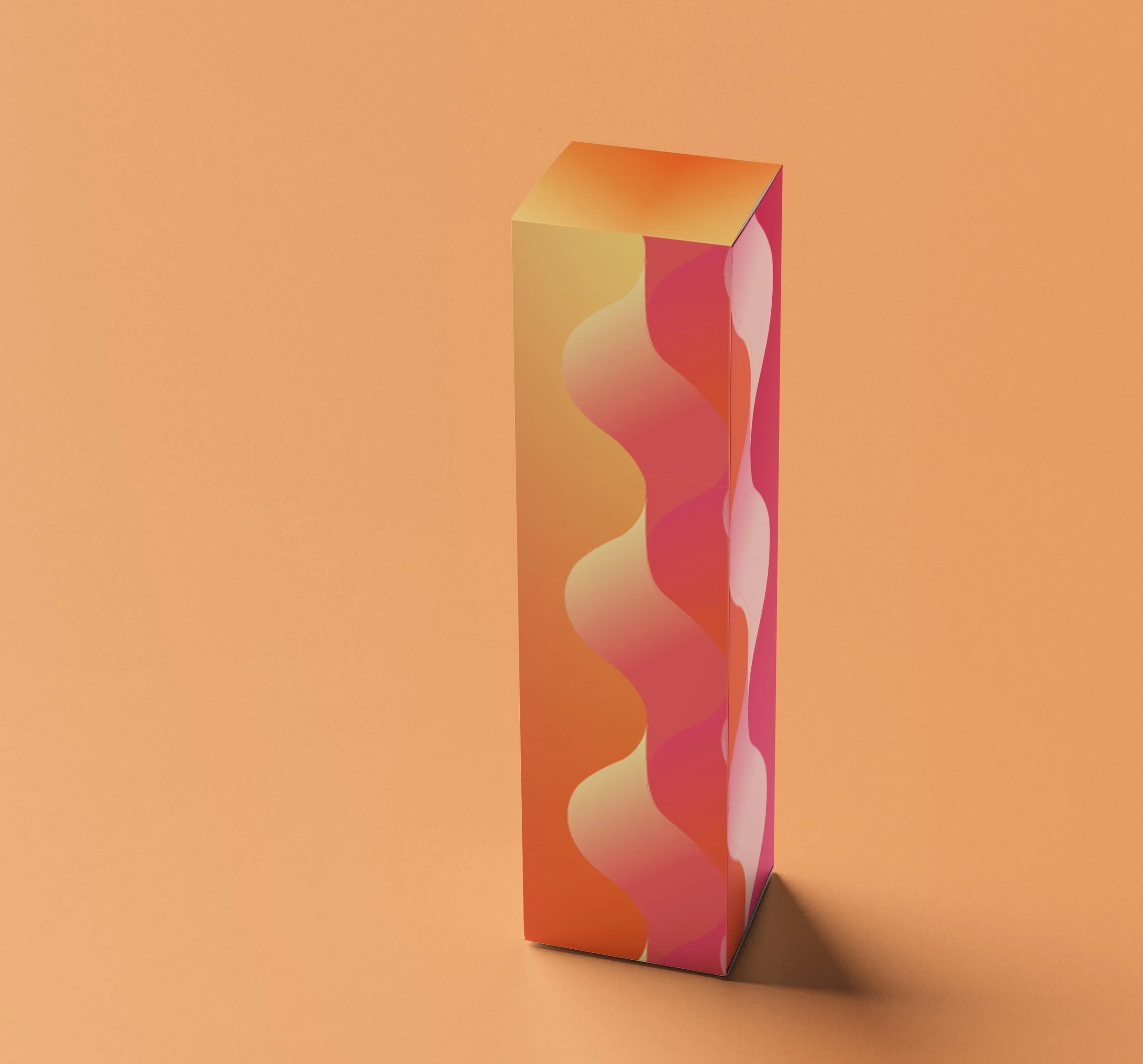
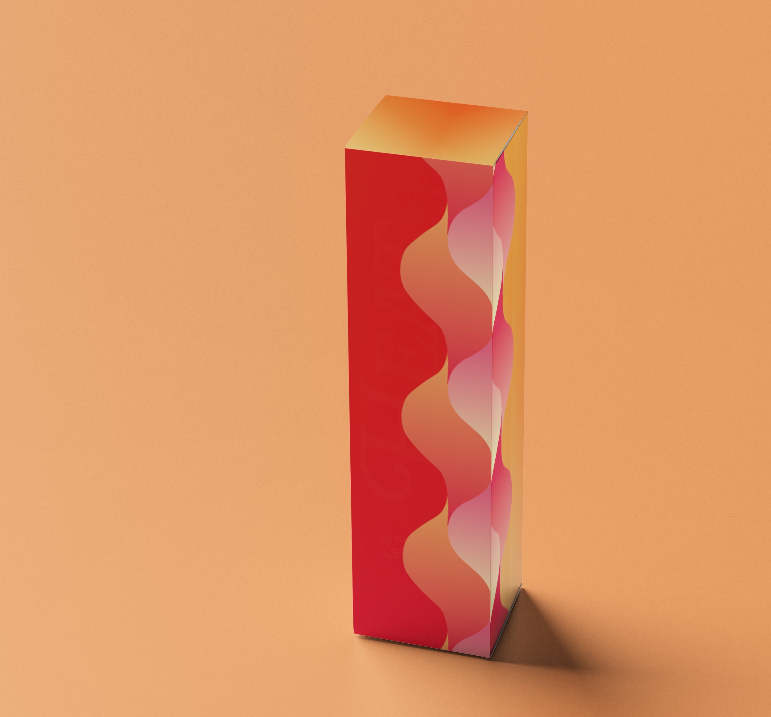
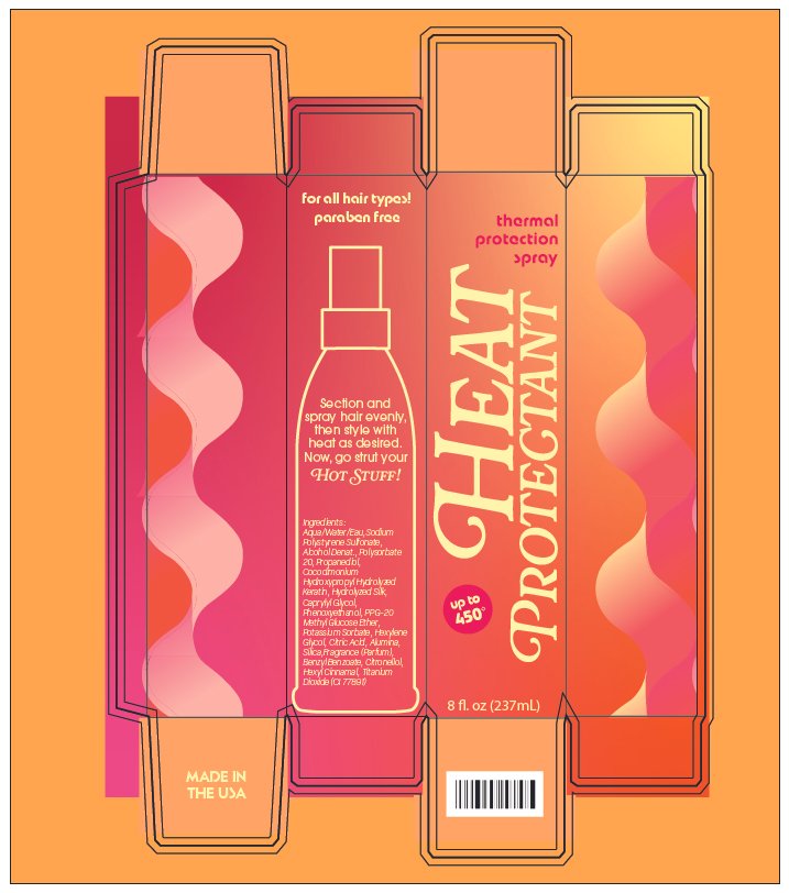
For the Heat Protectant Spray, I used bright pinks, oranges, and yellow to capture the heat and energy behind the product while tying into the bold colors of the disco era. The large cream typography creates contrast against the saturated background, while the wavy gradient pattern softens the box and brings in the movement of flowing hair. I also included a simple spray bottle illustration to break up the text-heavy panels and make the product’s purpose immediately recognizable.
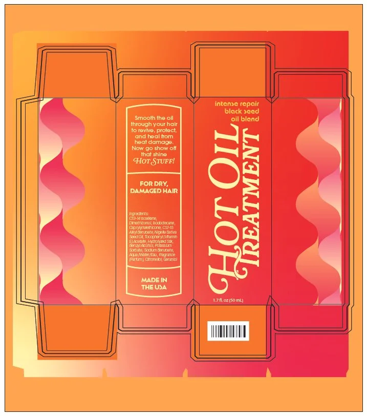
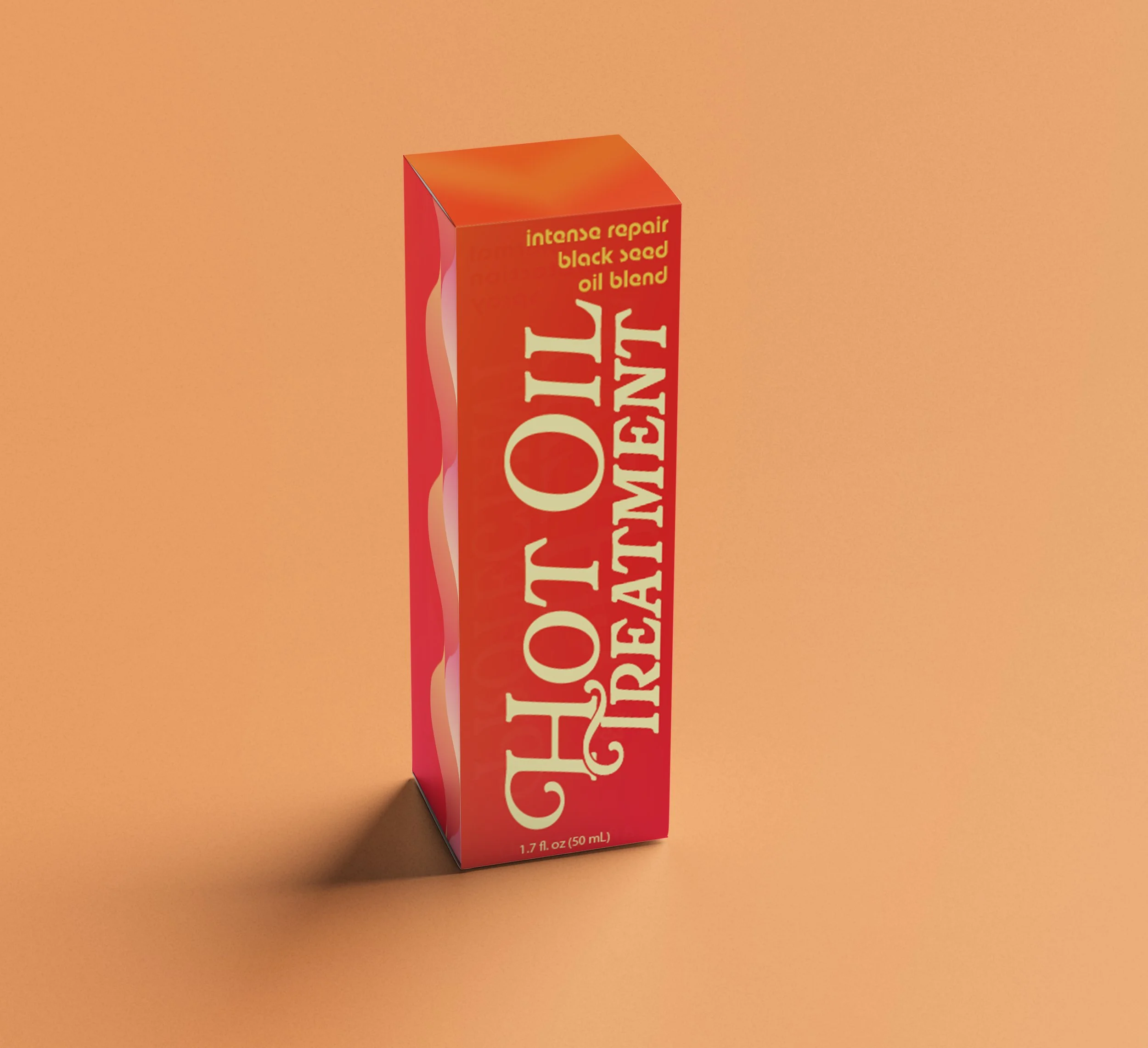
For the Hot Oil Treatment, I kept the same warm palette but leaned more heavily into orange and red to give the product a richer, more intense look that connects to the idea of heat and treatment. I repeated the wavy pattern from the spray packaging to keep the line cohesive, but changed its placement and proportions so the box didn’t feel like a copy of the first design. The oversized cream product name remains the focal point, creating a consistent visual hierarchy across both packages.