Dis-Moi
Fine-Dining Brand Identity
Dis-Moi is inspired by the relaxed beauty of Southern France; long dinners that turn into conversations for hours, warm coastal air, fresh ingredients, and the feeling of discovering a beautiful little restaurant hidden along the sea.
Mood
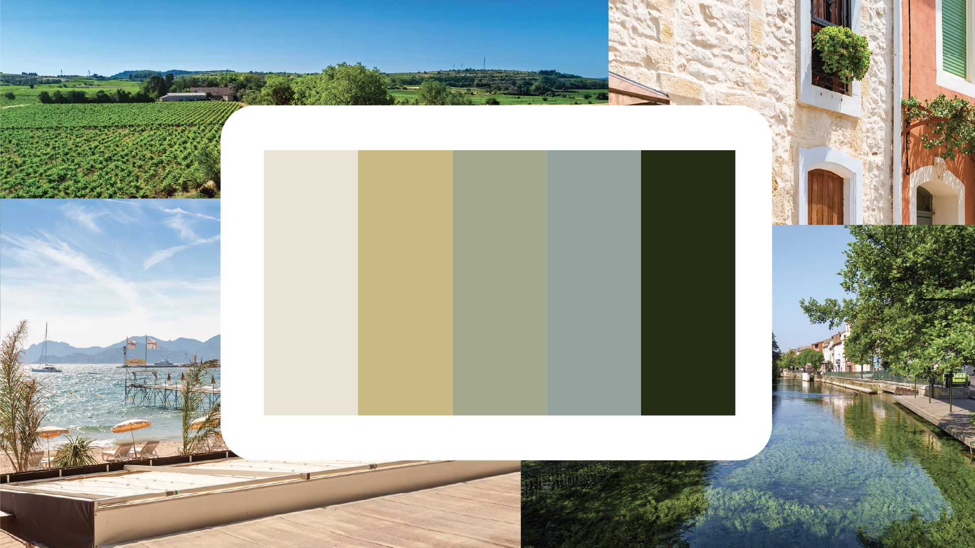
I wanted the branding to feel sunlit, relaxed, and naturally elegant rather than overly polished or dramatic. The muted greens and warm neutrals were chosen to reflect ingredients and textures commonly found in Provençal cuisine like olive oil, herbs, sea salt, aged stone, and fresh seafood. Small touches of blue were inspired by the Mediterranean coastline and help bring a lighter, more coastal feeling into the brand.
For the overall design style, I focused on creating something that feels understated but still memorable. The layouts are spacious and airy to mirror the feeling of long relaxed dinners and open coastal spaces. Rounded curves throughout the branding soften the identity and make it feel more inviting, while the typography adds structure and sophistication.
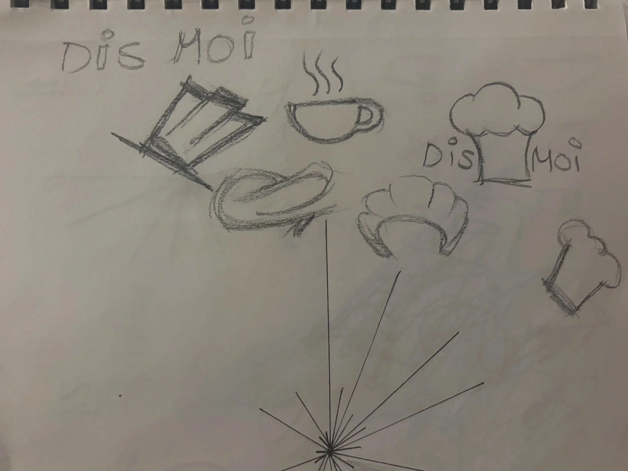
The logo process shifted to sketches inspired by the coast of Southern France. I explored shells, waves, sun shapes, and natural forms to create a coastal feel without making the identity too literal. Curved lines and organic shapes helped create a softer, more relaxed look, while simpler forms kept the concepts clean and refined. As I narrowed down the ideas, I focused on shapes that could be incorporated into the lettering and eventually developed into the final mark.
I started by sketching familiar French and restaurant imagery, including chef hats, food, and other common symbols. Getting these ideas out first helped me see what felt too generic and narrow down the direction I wanted to take. From there, I moved toward coastal imagery like shells, waves, and the sun, which better reflected the light, natural feel of Southern France.
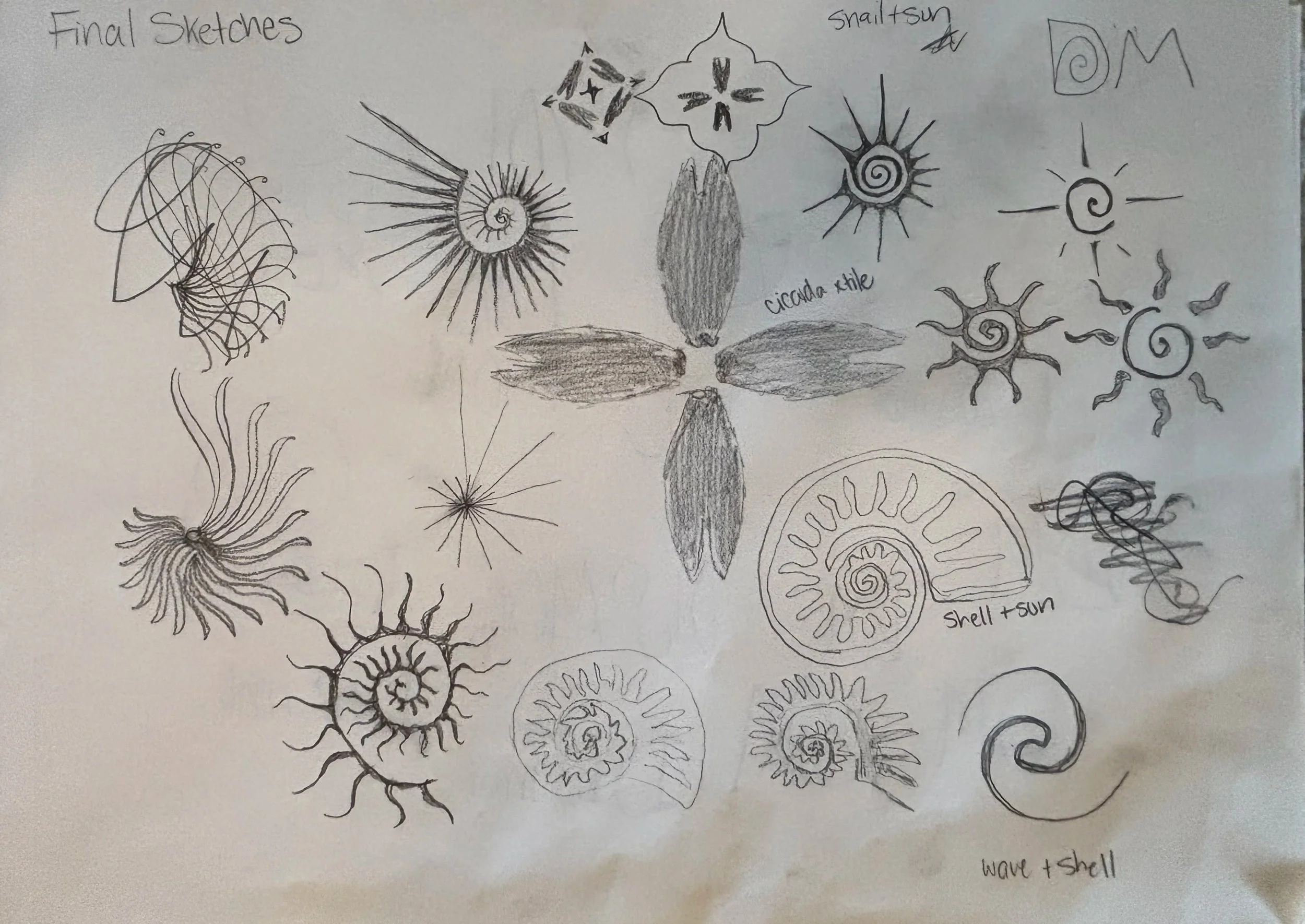
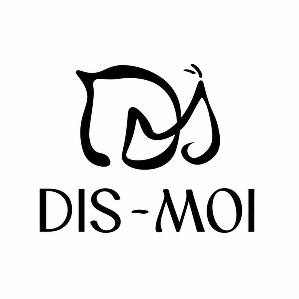
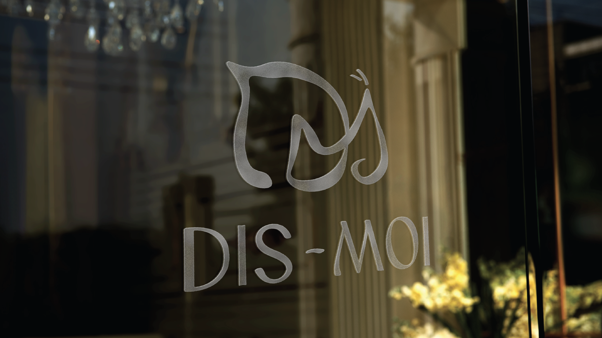
After exploring several directions, I landed on the snail as a way to connect the identity to escargot and French cuisine without using overly obvious French imagery. I combined the D and M from Dis-Moi to create the shape of a snail, with the D forming the shell and the M creating the body. This allowed the logo to work as both a monogram and a recognizable symbol while keeping the overall look simple and refined.
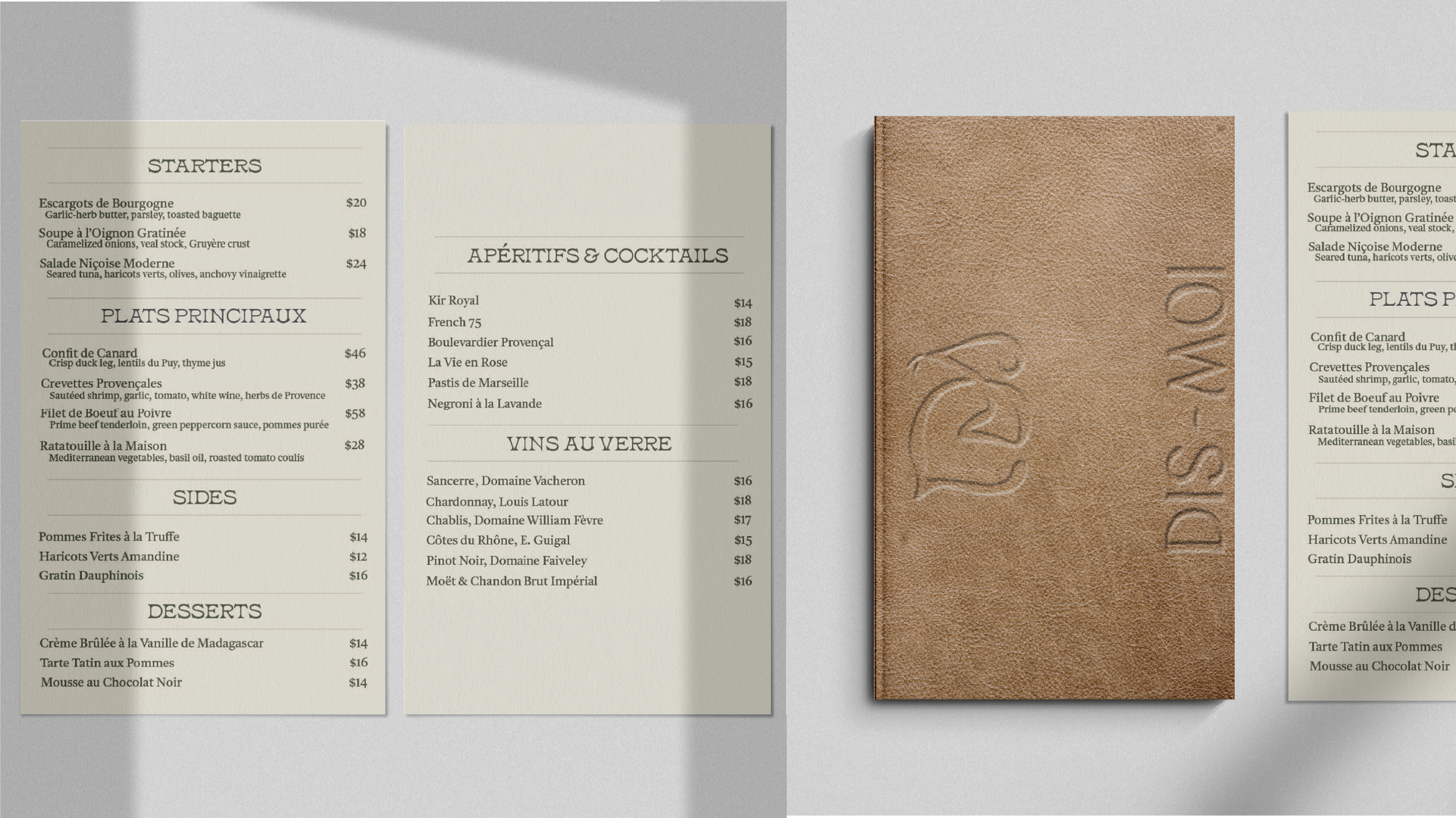
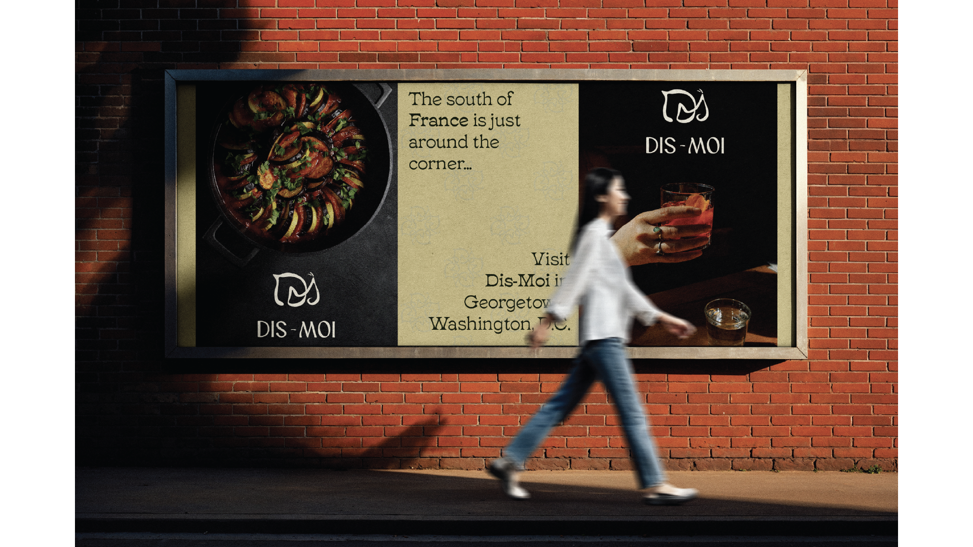
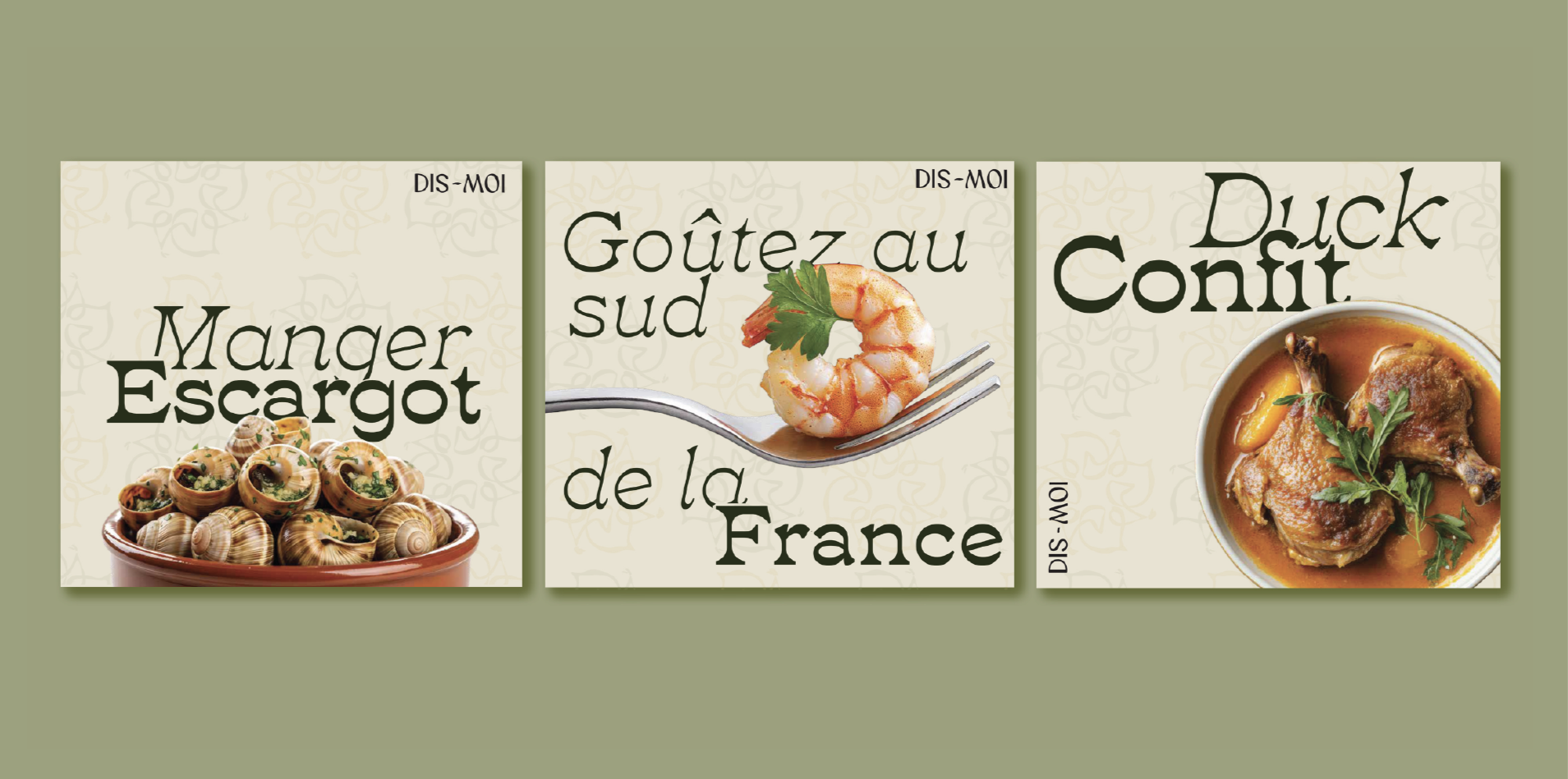
For Dis-Moi, the cuisine and cocktails are the heart of the brand and the strongest way to draw people in. The social media and billboard designs focus heavily on rich food photography, fresh ingredients, and beautifully crafted drinks to immediately create craving and curiosity. Instead of overly staged visuals, the imagery feels warm, intimate, and atmospheric — capturing the feeling of sitting down for a long dinner on the Southern French coast.